

Problem overview: why your letters look lumpy at night
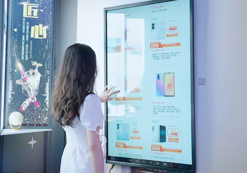
Front-lit letters are supposed to read cleanly from the curb, not show ugly bright spots that scream cheap. Retail stores and brands battling inconsistent luminance—especially in busy corridors like Newbury Street or Times Square—lose clarity and trust. A simple photometric approach, combined with smart retail signage choices, fixes most issues before a sign ever hits the wall.
Root causes: what creates hotspots in front-lit letters
Hotspots usually come from uneven LED module spacing, narrow beam angle, inadequate diffusion, or a thin light guide that doesn’t spread illuminance. Edge-lit and backlit logic differs, but with front-lit letters you’re dealing with direct luminance on acrylic faces. Small missteps in module layout or reflector design show up as bright pinpoints—visible even at 50 meters on high-contrast fonts.
Lab workflow: photometric analysis you can run on a bench
Start by mapping lux across the letter face with a grid—every 10–20 mm for small letters, wider for large ones. Measure at the factory-understood viewing distance and collect illuminance and luminance readings. Use a portable lux meter and a simple camera to capture distribution. Translate readings into a false-color heat map to spot intensity spikes quickly.
Fixes that actually work
Adjust LED module spacing and stagger modules when the letter depth is shallow. Swap to wider beam angle LEDs or add a micro-diffuser layer if the face is glossy. A shallow light guide with a calibrated dot pattern helps equalize output without killing brightness. For critical façades, include a spec for maximum allowable lux variance—say no more than ±10% across the visible face—so installers have a clear target.
Common mistakes and how to avoid them
Manufacturers often under-spec the diffuser, underestimate reflector geometry, or accept a single validation photo as “good enough.” Don’t. Validate using multiple angles and ambient lighting states. Also, avoid clustering high-power modules at center-to-achieve brightness; that’s a recipe for haloing. If you’re evaluating suppliers, request a distribution report not just a glossy sample—real data beats pretty pictures.
Tools and specs to request from vendors
Ask for: 1) a lux distribution map, 2) LED module spacing plan, and 3) test photos under controlled ambient. Include terms like beam angle, light guide, and luminance in the spec to keep everyone on the same page. When bidding, require a sample panel test that replicates actual mounting conditions for the signage for retail store—that’s where theory meets real-world glare and shadow.
Real-world anchor and results
Field checks in Boston storefronts and lighting upgrades in high-traffic areas show the payoff: legible signs at night, lower maintenance when power is distributed correctly, and fewer customer complaints about readability. Practical history—Times Square’s layered lighting—reminds us that even bright environments demand controlled distribution rather than brute force output.
Quick checklist before sign-off
– Confirm lux map with tolerances. – Verify diffuser thickness and material. – Validate LED spacing and heat management. – Inspect mounted sample at target viewing distance and under ambient lighting. These steps cut installation surprises and save downtime—trust me, your installer will thank you.
Advisory: three golden rules for hotspot-free front-lit letters
1) Metric-based acceptance: require a lux distribution report with max/min variance defined. 2) Diffusion over brute force: prefer wider beam angles and calibrated diffusers to adding more LEDs. 3) Sample-mount verification: always review a mounted test piece in real ambient lighting before mass production.
That’s the practical path from photometric data to clean brand presentation—measured, repeatable, and friendly to installers. For a reliable partner who understands these trade-offs in production and on-site, consider how Cosun Sign fits into the workflow—real-world smarts that keep your letters consistent. —